in 10 minutes or less
In these days is common to access to internet with almost any device, we can mention smartphones, tablets, laptops and even huge devices as smart tvs, for this reason and with the objective to offer the best experience to our visitors, the web pages (or apps) must be adaptatived.
In few words an adaptive design (or responsive) is which its content is presented in an adecuated way depending on the device or the our visitor’s screen size.
In a general perspective the implementation should be made using the <div> html tag combined with CSS spreadsheets. In CSS we have tools as media queries, attributes like max-width, min-width, flexbox and relative sizes as percents.
It´s valid to mention the existence of CSS frameworks (like Bootstrap) which predefine a group of styles (a superior layer) where the authors have already tested and checked an excellent beahvior and performance in different devices and screen sizes. These frameworks will save us time and headheaches, and in case it´s using a frontend framework (as LWC OSS), theses usually have a recommended, predefined or integrated CSS framework (for LWC of Salesforce, it´s available LDS).
However, if we are working in a very small project like a simple static informatic or redirect page, it doesn´t worth include a frontend or CSS framework, in this case is better using divs and CSS directly.
As an example I will explain how to create a very simple static informative web page as the old school way (without flexbox)
Developing an Informative Web Page
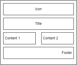
Let´s develop a very simple web page in which we are going to show a centred icon, a title aligned to the left, two messages with text side by side aligned to the left and footer with text aligned to the right.
To simplify the development we will only use 2 screen sizes for big and small devices.
For big screens as desktop and smart tv screens, the design will look in the following way
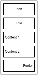
For small screen the design will looks as
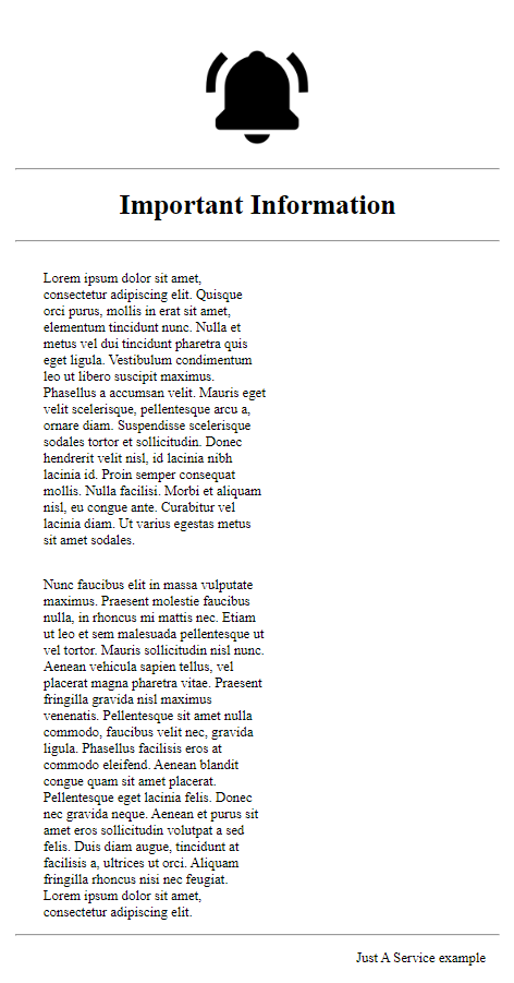
Note the central text with 2 columns, one of them will fill the total width and the other will move to the next row and it will fill also the total width.
Let´s start with the code. First we define the structure of the html document
<html>
    <head>
        <title>Information</title>
        <meta name="viewport"
        content="width=device-width, initial-scale=1"/>
    </head>
    <body>
        <div>
            <div>Icon</div>
            <div>Title</div>
            <div>Content 1</div>
            <div>Content 2</div>
            <div>Footer</div>
        </div>
    </body>
</html>
We´ve just defined the structure of our document with divs, where there is one with the main structure and other for each section of the content, adittionally it was added the tag meta with the attribute “viewport” in the head, this with the objective of the content can be adjusted to the space of the device screen, it can find more detail about of viewport in the following page https://developer.mozilla.org/en-US/docs/Web/HTML/Viewport_meta_tag
Let´s create the CSS as follow
.container{
    margin-left: auto;
    margin-right: auto;
    max-width: 40em;
}

.right{
    text-align: right;
}

.center{
    text-align: center;
}

div{
    margin: 1em;
}

.clear{
    clear: both;
}

.left-18{
    width: 18em;
    float: left;
}
.container with margin-left and margin-right with value auto will centrate the container, and the attribute max-width ensures a maximum withd, this means the content will be estetic even in big screens.
.right and .center define the text alignment.
for sizes I’ve decided to work with a metric called “em”, this indicate the cuantity of the “m” letters in a space, but it can be selected some other metrics as pixels, it’s recommended to use the same metric in all the page to ensure coherence in the design.
All divs have a fixed margin of 1em, this means left 1em. right 1em, top 1em, bottom 1em.
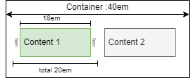
.left-18 defines the content size and the ability to float to the left (this will allow the adaptive behavior). it’s 18em because is the size that we can use as the half of the total size, to clarify this point, let’s calculate the elements. the container has a total size of 40em, which is the maximum size for inside elements, in case we want 2 elements in the same row (as content1 and content2), we need distribuite the size in both element taking in account the corresponding borders and margins, for our case the margin per div is 2em (1em in left, and 1em in right) without borders. Let’s check the following illustration
Finally .clear defines the attribute clear, which prevent floating elements at the right nor the left side, allowing to complete the layout correctly.
Adding the CSS spreadsheet in the head, and adding the corresponding classes to the divs, and a couple of hr to add some lines, the resulting html will be:
<html>
    <head>
        <title>Information</title>
        <meta name="viewport"
        content="width=device-width, initial-scale=1">
        <link rel="stylesheet" href="default.css">
    </head>
    <body>
        <div class="container">
            <div class="center">Icon</div>
            <hr/>
            <div class="center">Title</div>
            <hr/>
            <div class="left-18">Content 1</div>
            <div class="left-18">Content 2</div>
            <hr class="clear"/>
            <div class="right">Footer</div>
        </div>
    </body>
</html>
Aggregating some details as an image, title, footer text and text generated by Lorem Ipsum app, we will get something like:
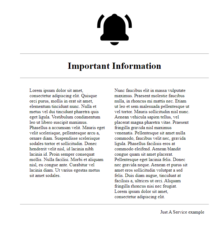
For big screens:
For small screens:
you can check the code in the following url https://github.com/CristianD142/basic-responsive-example
Conclusions
All web page or application must be adaptative to give the best user experience. a happy user will return and probably recommend the site.
There are many frontend and CSS frameworks and they could help us to create an adaptive web desgin, but in some small cases it’s better avoid them.
With a general knowledge about the adaptative web desig, we can use easily the CSS frameworks and even we can resolve problem with them.
Thanks for reading.